GRAVILUX (1998)
Click to buy the Gravilux iPhone/iPad and Mac apps based on the original artwork.
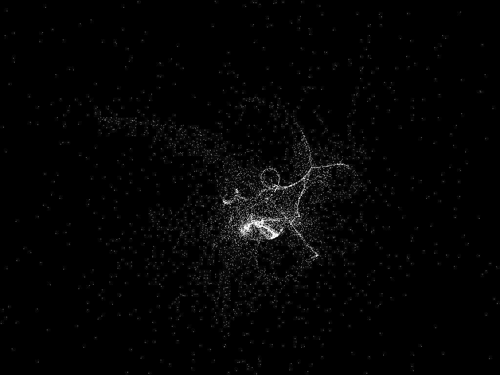
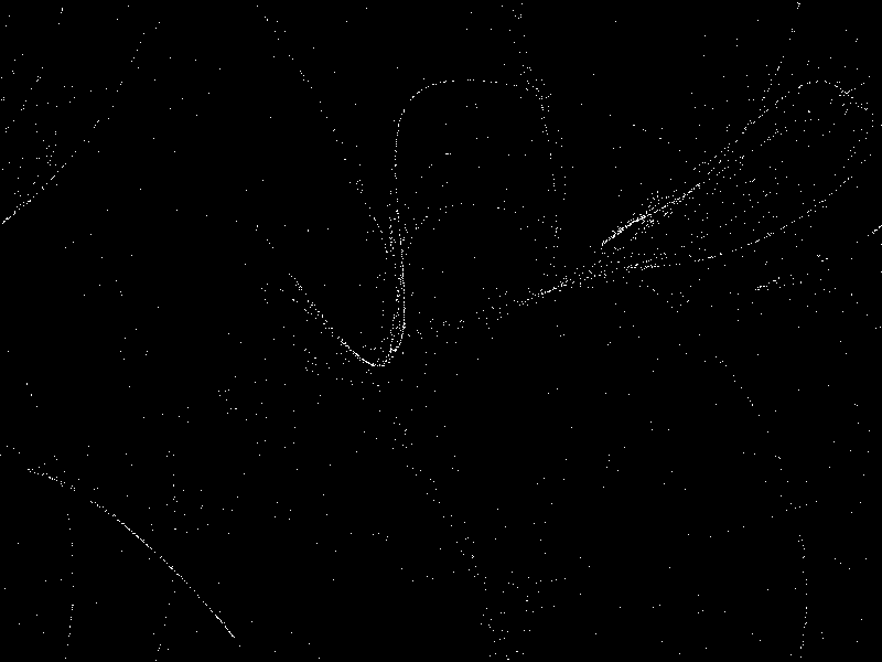
With each movement of the mouse in Gravilux, you exert a gravitational pull on a world of simulated stars. Though inspired by Newton's equations, Gravilux doesn't follow our universe's laws. The stars wrap from one side of a flat world to the other and their apparent three-dimensional movements are a perceptual illusion. Stars are also free from mutual attraction, preventing the forming of galaxies and solar systems; and here antigravity is possible.
Gravilux begins with a stage trick as a Cartesian grid transforms into a natural system that behaves in turn like galaxies, subatomic particles, or dust on a pond. This transformation is a metaphor for the Dynamic Systems Series itself, which tries to convey an instrumental, naturalistic, and infinitely expressive experience within the confines of computation. Gravilux's name is an homage to the Clavilux—an early light performance instrument, also known as a color organ, created by the early twentieth century artist Thomas Wilfred
EXHIBITION HISTORY
NTT Intercommunications Center, Tokyo, Japan, 1999
Deitch Projects, New York, 2000
Arte Digital IV, Cuba, 2002
Art Association Gallery, Jackson Hole, Wyoming, 2002
Arizona State University, 2004
Tarble Arts Center, Illinois, 2004
London ICA, 2006
…
ABOUT THE DYNAMIC SYSTEMS SERIES
Gravilux is part of the Dynamic Systems Series (Gravilux, Bubble Harp, Myrmegraph), a series of screen-based artworks driven by human touch. The only way one's body enters a desktop computer is through the mouse, and the cursor is the projection of the body into the screen. Take a close look at a desktop computer's screen and you'll notice that the most lively element is the cursor: the only object that moves with personality. These works take the cursor—the projection of the body into the computer—and create a system in response. With the introduction of the iPhone and similar devices, your body now directly connects with these systems through physical touch.
Each work in the Dynamic Systems Series is what scientists call a dynamic system: a model of natural, mathematical or algorithmic reality. These systems let you touch an immaterial world that has consistent and predictable reactions, and the infinite variety of nature. Although there are few suprises when you visit a beach or pond, the experience is subtly different each time. Similarly, with these artworks the intention is for a person to feel an instant and intuitive sense of presence and control, while spending more time with a system provides greater reward. Like a musical instrument, the effect of the program on the mind is equal to the effect of the mind on the program.
These pieces blur the line between artwork and art-making tool. The artwork is the set of rules, which construct a system in which the viewer is an essential part. A traditional media example of this concept is Sol LeWitt's work—sets of algorithmic drawing instructions for gallery staff to execute, rather than a computer. However, within the dynamic medium of computation, the expression of the rules continuously changes in response to the active collaboration of the viewer.
FROM TOOL TO ARTWORK
Having created numerous "visual music" programs during the 1990s as an offshoot of an education in Computer Science at Brown University and Experimental Animation at RISD, I sought to probe the boundary between a tool and a work of art. These experiments blurred the lines between drawing, animation, scientific visualization, art, and games. In 1989 I created Motion Sketch (1989) and later a networked version, Motion Phone (1995): programs to author abstract animations similar to those created by Oskar Fischinger. After years of creating such programs, I set the following constraints to produce a series that more clearly stood as works of art:
Full Screen. Having studied cinema, I noticed that the computer's screen has the potential of cinema: as a rectangle of time-varying light it provides an infinite canvase. By taking over the full screen, one can create an entirely new immersive reality that replaces the false world of desktop tools.
Human gesture. Use human gestures as the sole input, since this is the body's entry into the computer; and only use geometrically essential properties for control such as direction, distance, and speed, avoiding artificial constructs like the cartesian x- and y-axes.
Immediately knowable, infinitely scalable. In evaluating whether a sketch became an artwork, examine it to see if it can be understood and used without instructions, and more importantly, whether one can get better at the experience as one does with a musical instrument. The experience should reward more time invested and offer an infinite palette of expression, with surprises of discovery, and the possibility of mastery.
No interface. Remove all interface tools such as menus, icons, and pointers: these elements create the illusion of a workplace rather than an immersive experience.
No color. Stick to pure black and white and focus on movement as the early abstract animation pioneers Oskar Fischinger and Len Lye. This constraint was arbitrary, but one that focused the artistic process and gained inspiration from these pioneers' astonishing works.


